Karen Mejía.
Multidisciplinary industrial designer
Connect
Mexico City
56 2565 4482
Social
ig: @bykarenmo
karenmo.mejia@gmail.com
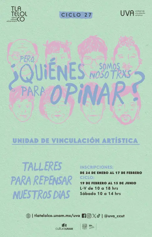
CYCLE 27 Visual identity
Who are we to have an opinion?
During my stay at the Artistic Connection Unit (UVA), I participated in the creation of the visual identity for Cycle 27, Who are we to have an opinion?, which included a great variety of illustrations that represented the different workshops offered at UVA, choosing the color palette and typography used in the different institutional posters, also collaborating in adapting the design to the required graphic guidelines.
Part of my work consisted of creating illustrations for the 80 workshops presented that cycle and organizing the mandatory elements that, by institutional norm, had to be included in each piece.
All the versions developed went through various review filters before publication or printing, which allowed me to thoroughly understand the validation processes and visual coherence within a cultural institution.
INFO:
Client: Artistic Connection Unit (UVA)
Date: February 2024
Location: Mexico City, Tlatelolco.
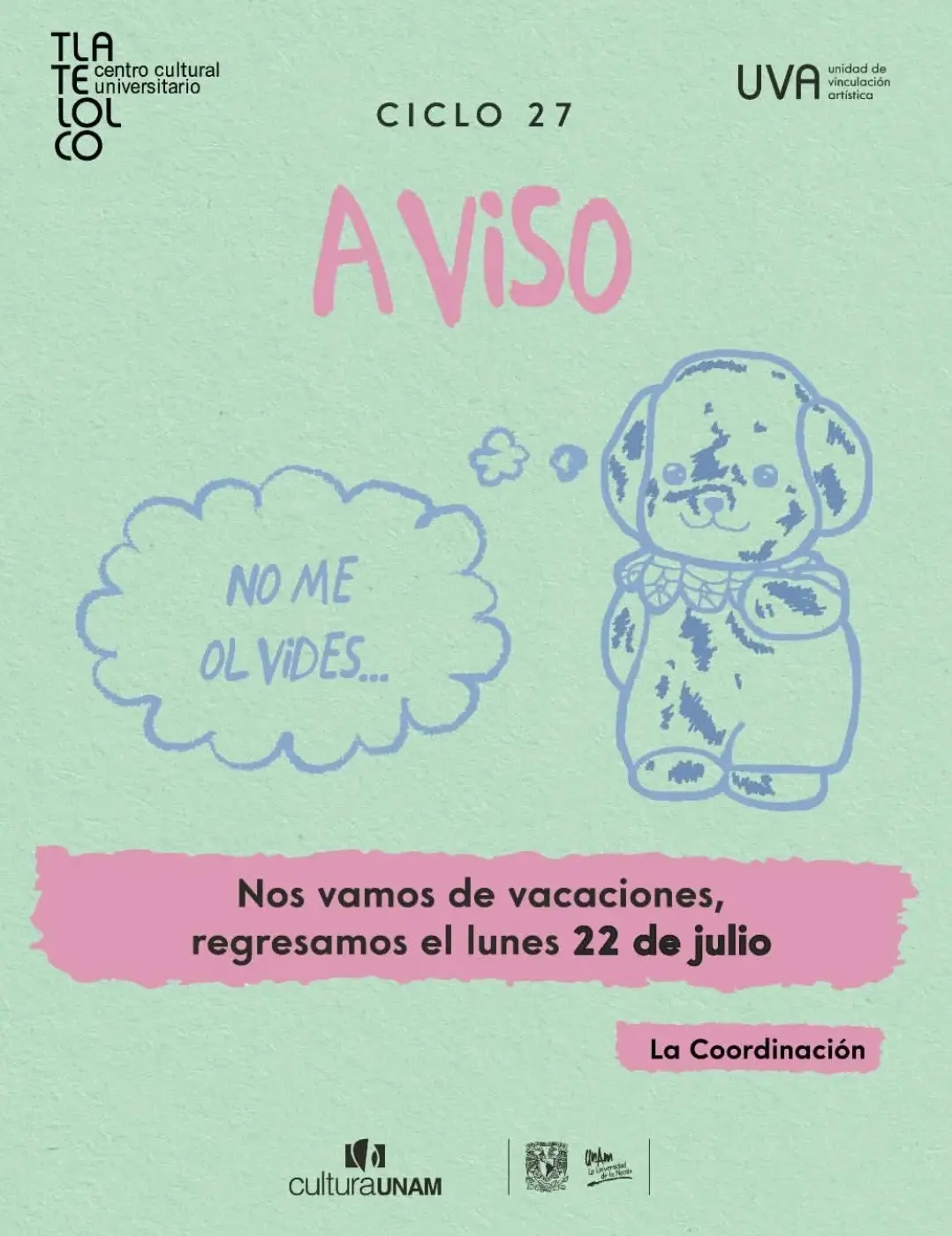
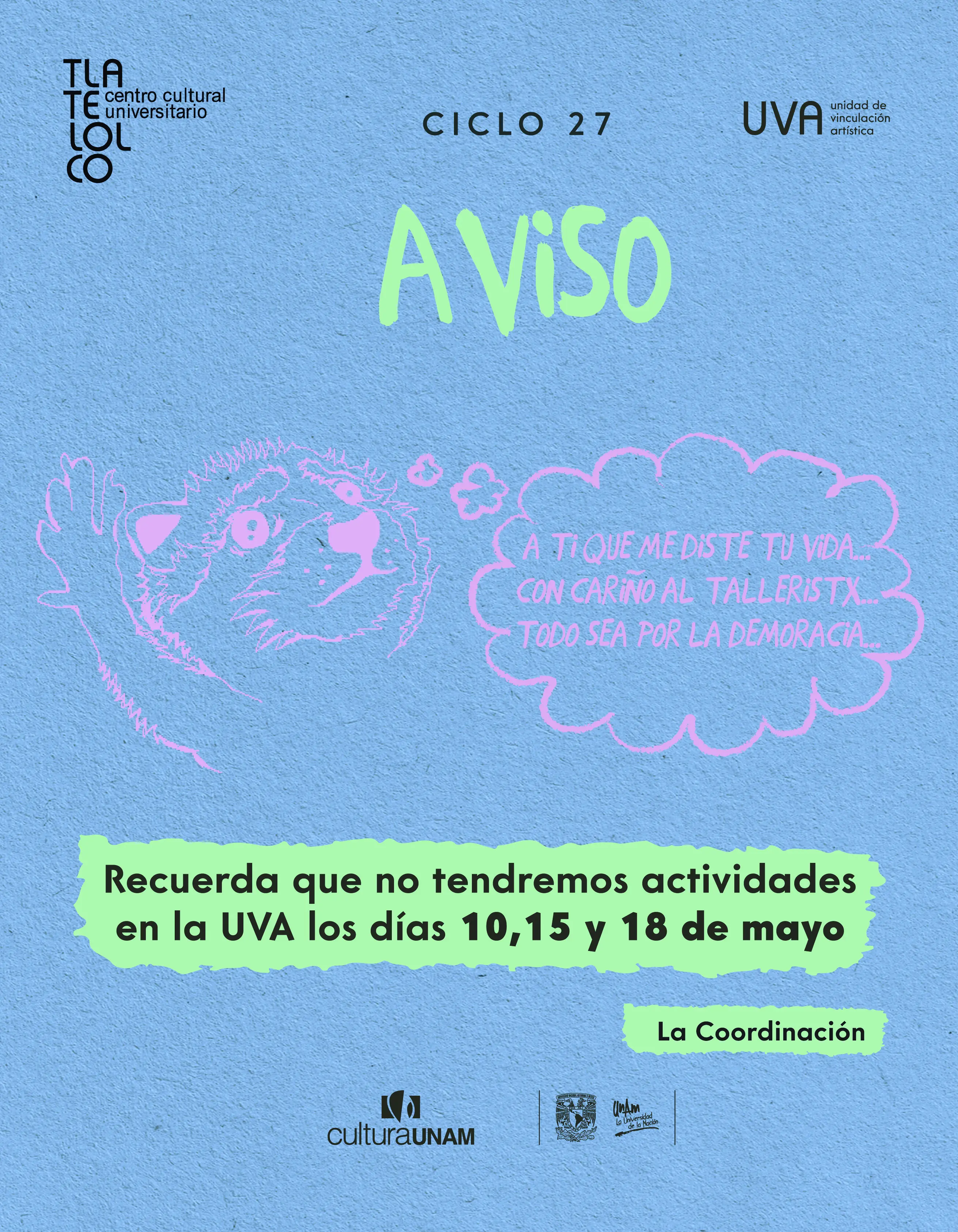
CYCLE 27 Animations
Who are we to have an opinion?
Within my responsibilities, I developed illustrated pieces to announce vacations, holidays and special activities. These pieces required a dynamic visual approach and a touch of humor, adapted both to current trends and to the characteristic style and tone of the coordination team.
Each animation was designed not only to inform, but also to connect with the community in a close, light and creative way, integrating original illustrations that reflected the institution's identity.
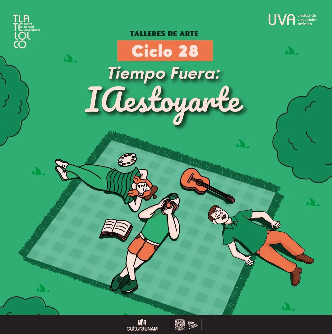
CYCLE 28 Visual identity
Time and Out: IAestoyarte
With the beginning of a new cycle, I had to design a new visual identity, creating animations, characters and color palettes, as well as choosing typography.
One of the most important tasks was designing informative posters that would announce the complete offer of UVA workshops, which in each period included more than 80 activities.
These posters had to be visually attractive and contain the necessary information to capture the attention of potential students, facilitating their understanding without losing clarity or graphic balance.
The challenge consisted in organizing a large amount of data in an orderly and functional way, respecting the guidelines of the visual identity manual and maintaining an aesthetic coherent with the institutional language.
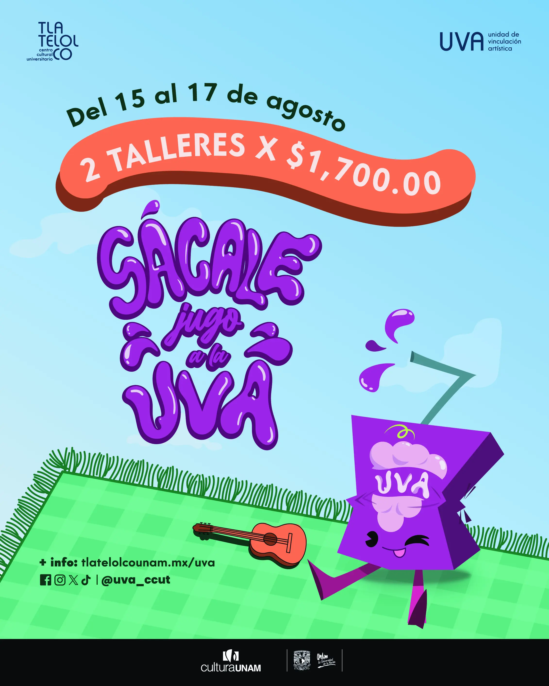
CYCLE 28 Illustration
UVA Juice
As part of promotional campaigns, I created an original illustration to announce a special 2x1 workshop dynamic.
This piece was created entirely in Adobe Illustrator, taking care of every detail from conceptualization to final composition.
The objective was to generate a striking image, aligned with the institution's visual identity, that would clearly and attractively communicate the promotion, encouraging public participation in UVA's cultural offer.
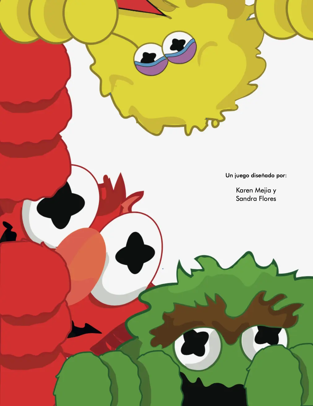
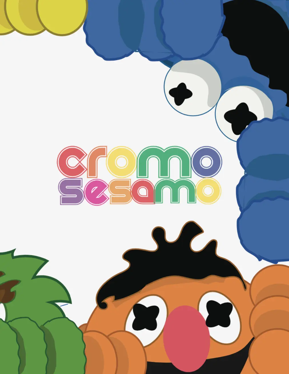
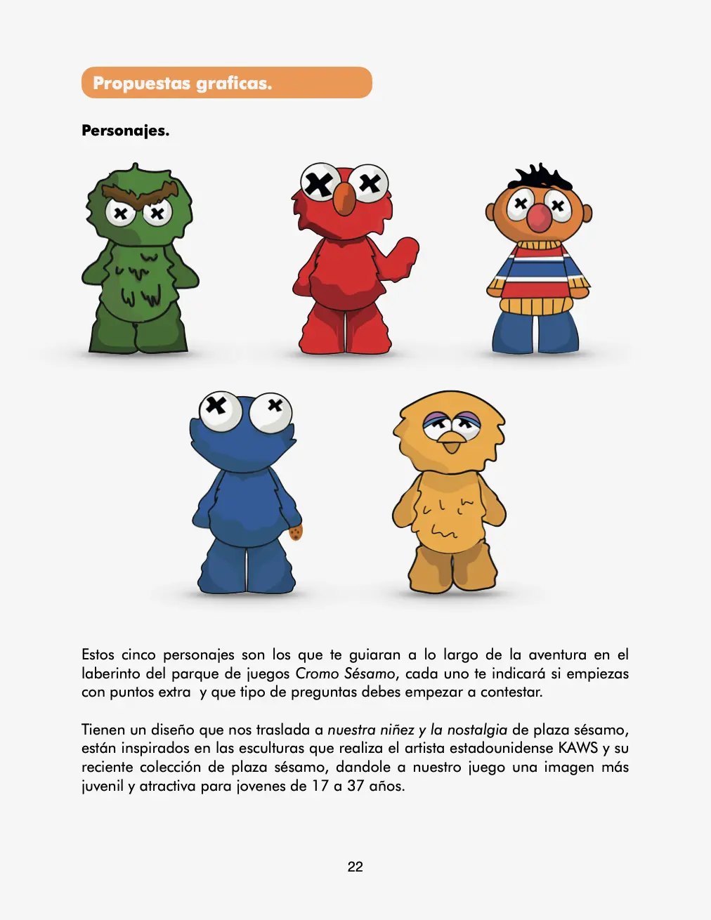
Cromo Sesamo, board game.
Student magazine, about a board game inspired by Sesame Street.
I developed a board game inspired by the visual and narrative universe of Sesame Street, recreating character design, graphic proposal and game elements.
This project also included the creation of an explanatory magazine aimed at university students, documenting the entire creative and production process, from initial conceptualization to final graphic decisions.
I was responsible for the complete editorial design of this publication, specially designed for distribution in print media, taking care of both narrative clarity and visual coherence on each page.
INFO:
Client: Universidad Tecnológica de México
Date: April 2024
Location: Cuitláhuac.
Creative direction
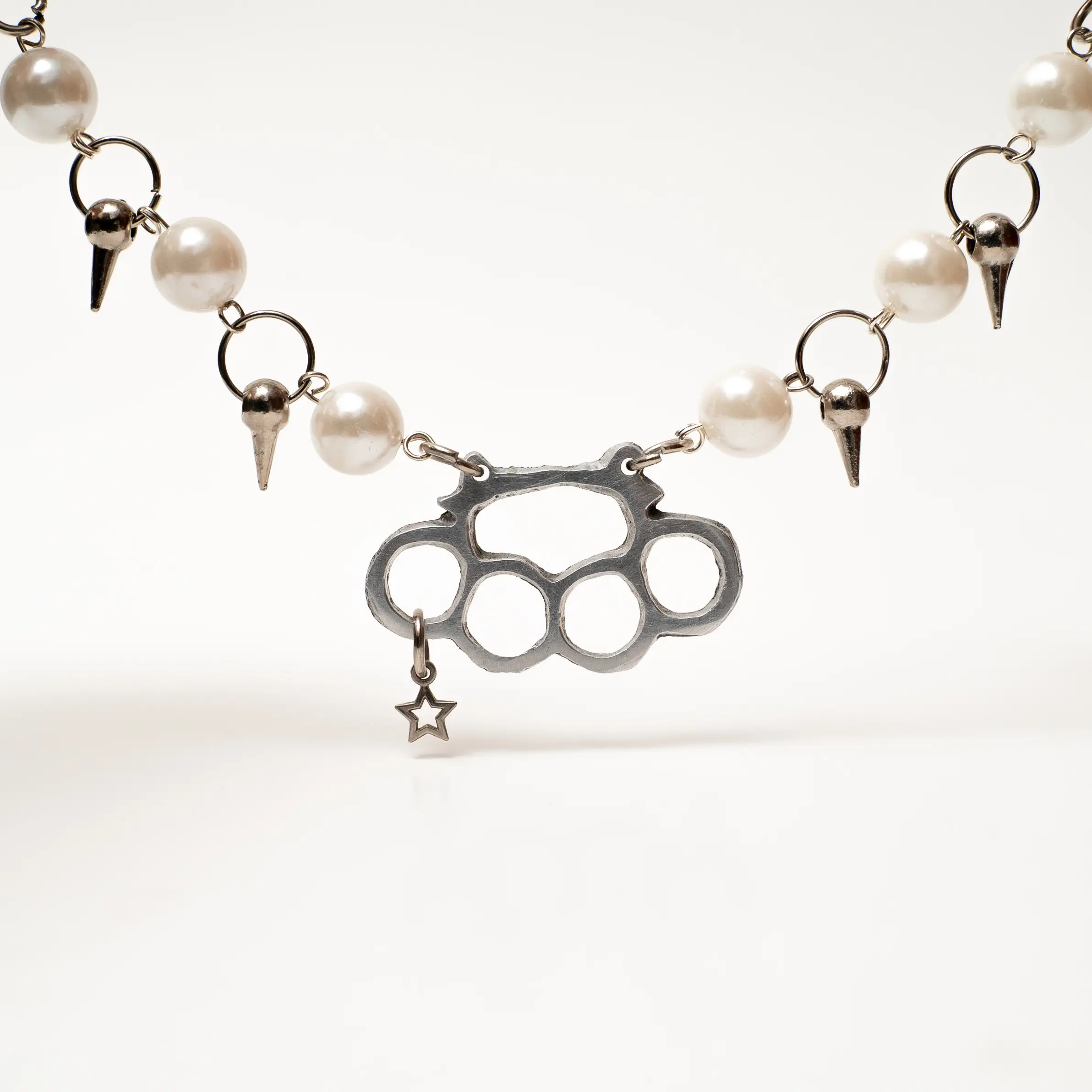
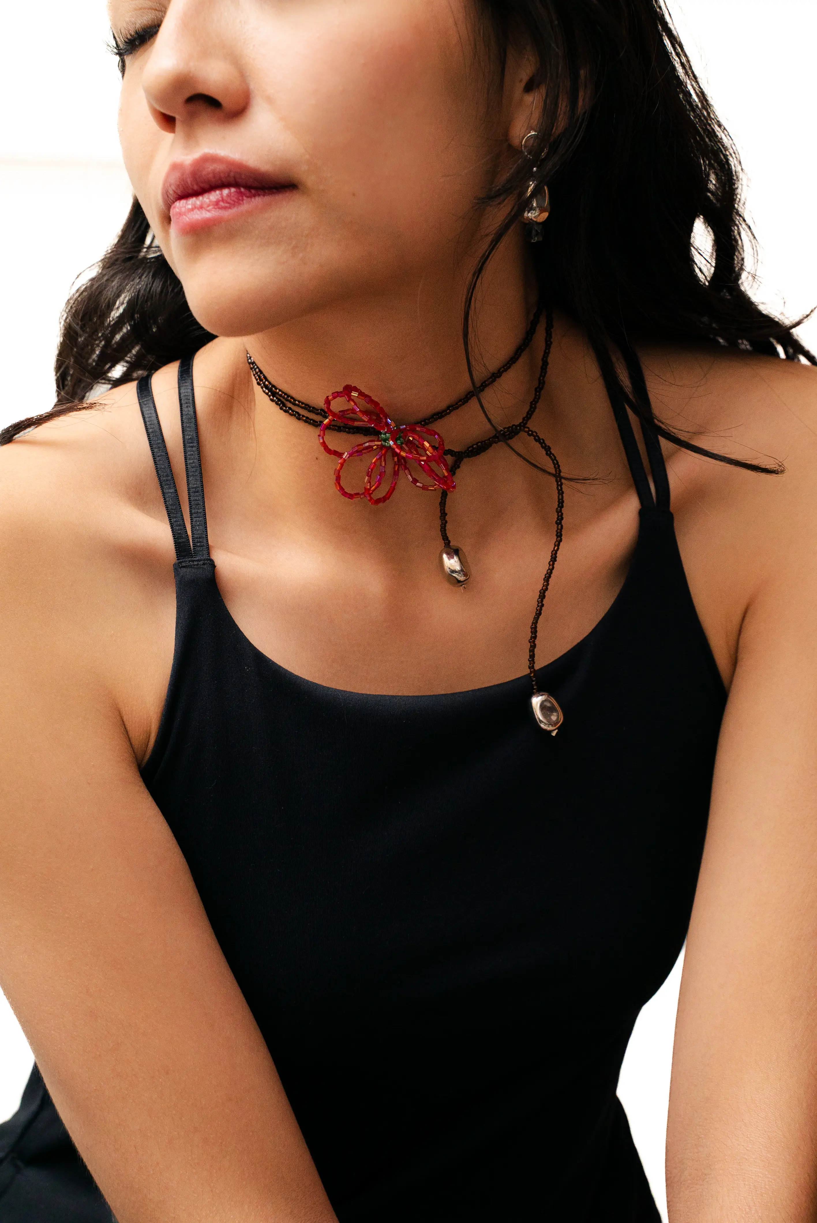
By Karen Mo spring collection
For the spring collection of my jewelry brand, I carried out all the creative direction of the project.
I designed each of the pieces in the collection, developed a new logo that reflected the evolution of the brand and conceptualized both the aesthetics and visual style of the campaign. I also proposed key ideas for the photoshoot, including compositions, color palette and poses, ensuring a coherent visual narrative.
All this work was consolidated in the brand identity that is currently reflected in the Instagram feed, creating a careful, authentic and aligned visual experience with the brand values.
INFO:
Client: By Karen Mo
Date: February 2025
Location: Mexico City